Your Logo Has a Birthday Too: The Case for Retiring a Brand Before It Retires Itself
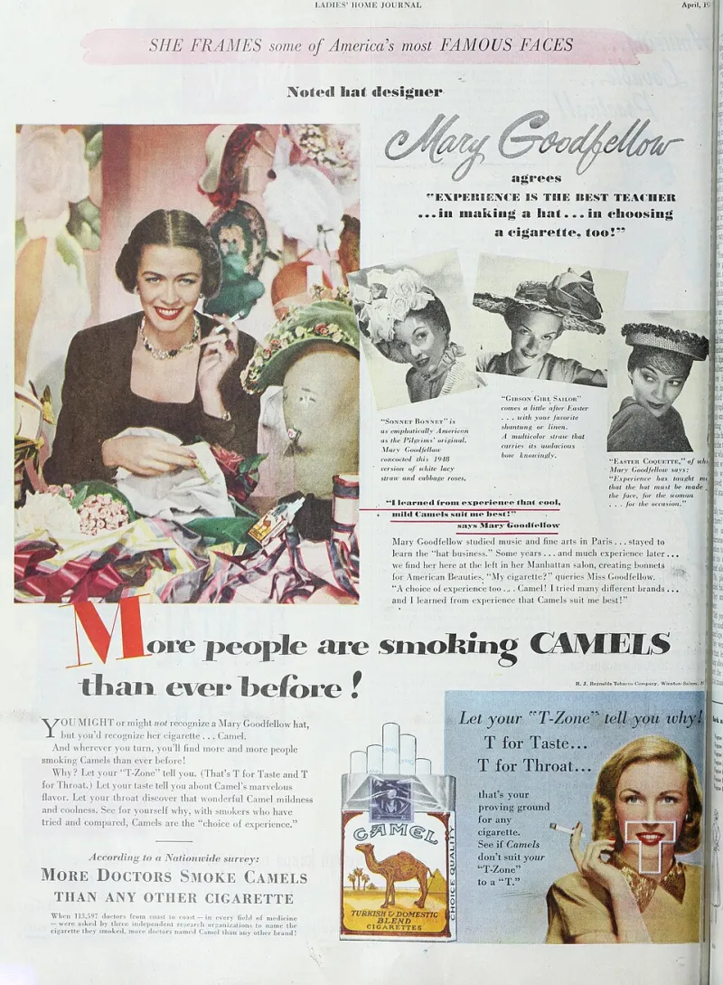
Photo: Internet Archive Book Images, Public domain, via Wikimedia Commons
There's a particular kind of British business that treats its brand like a family heirloom. The logo was drawn in 1998 by someone's nephew. The colour palette was chosen because it printed well. The website still has a page called 'Our Journey'. And every year, someone in the boardroom suggests a refresh — and every year, the room flinches.
Here's the uncomfortable truth: brands don't age like wine. They age like milk. Slowly, then all at once, and usually in front of a customer.
The Flinch We Need to Talk About
The fear of rebranding is almost never rational. It's a cocktail of sunk cost, personal attachment and the vague dread that the new version will be somehow 'less than'. The founder who built the business under the old mark feels the logo is them. It isn't. It's a piece of communication infrastructure, and infrastructure that stops being maintained starts working against you.
What's stranger is that the fear is usually aimed at the wrong audience. Business owners assume customers will be upset by change. In reality, most customers notice a rebrand for roughly eleven seconds, shrug, and get on with buying things. The people who genuinely struggle with change are the people inside the building.
Evolution Beats Revolution
I spoke with Priya Nandra, a brand strategist who's worked with everyone from Manchester scale-ups to a 90-year-old Midlands manufacturer, and her view is refreshingly unsentimental.
'Nobody should be torching their identity every two years,' she told me. 'But a brand that hasn't evolved in a decade is making a statement whether it means to or not. The statement is: we stopped paying attention.'
Her argument is that the best rebrands are barely visible in any single moment. Think of how the big British supermarkets have nudged their marks over twenty years — each change small enough to avoid a backlash, each change compounding into something unrecognisable from where it started. Evolution, not revolution. You don't renovate the house by burning it down. You replace the windows.
She's also blunt about the trigger most firms miss: 'If your brand was designed before smartphones, it was designed for a different attention economy. It was built for print, for shopfronts, for slower decisions. That world is gone.'
Five Signs It's Time for Version Two
If you're wondering whether your brand is due a decade-defibrillation, run through this checklist. Two or more ticks and you've got your answer.
- It was designed for paper. If your identity works beautifully on a letterhead but falls apart on a phone screen at 3am, it's a print-era artefact.
- Your team apologises for the website. When staff preface your URL with 'it's a bit dated but—', that's not modesty. That's data.
- You look younger or older than you are. If your brand skews a decade older or younger than your actual customer base, you're speaking to the wrong room.
- Competitors who launched after you now look more established. Polish reads as credibility, fairly or not. If newer firms look more 'real' than you, your identity is costing you money.
- Nobody can articulate what you do in one sentence. Brands drift. The words on your About page were written by someone who left in 2011.
The Decade Rule
Nandra's advice is almost boringly simple: put a rebrand review in the calendar every ten years, the same way you'd review insurance or premises. Not a full reinvention — an audit. Does the identity still fit the business you've become? Because the business always changes. It's only the brand that refuses to.
British firms love to talk about heritage. Fine. But heritage is a story you tell, not a JPEG you defend. Version Two isn't a betrayal of where you came from. It's proof you're still going somewhere.